You designed something beautiful on your laptop. You send it to the printer. Three days later, you pick up your flyers and... the edges are cut wrong. The colours look dull. There's a white line where there shouldn't be.
This happens all the time. Not because the printer made a mistake. Because the file wasn't ready.
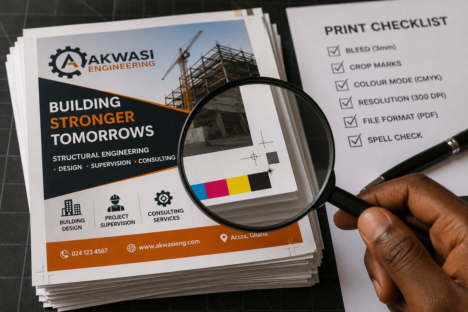
Here's what to check before you send anything to print.
1. Bleed (this is the most important one)
Bleed is extra space around your design that gets cut off. Why? Because printers can't print perfectly to the edge of a page. They print slightly larger, then trim.
What you need: Add 3mm of bleed on every side. That means your background image or colour should extend 3mm beyond where you think the edge will be.
Common mistake: Putting important text or logos too close to the edge. Keep all critical content at least 5mm away from the trim line.
2. Crop marks (tell the printer where to cut)
Crop marks are small lines at the corners of your file that show exactly where to trim. Most design software adds them automatically when you export with bleed settings.
What you need: Turn on crop marks in your export settings. If you're using Canva, look for "crop marks and bleed" under download options.
Common mistake: Drawing your own crop marks with lines. Don't do this. Use the software's automatic ones.
3. Colour mode: CMYK vs RGB
Your screen uses RGB (Red, Green, Blue). Printers use CMYK (Cyan, Magenta, Yellow, Black). They are not the same.
What you need: Convert your file to CMYK before sending to print. Bright neon colours on your screen will look dull on paper. Deep blues might turn purple.
Common mistake: Designing everything in RGB and wondering why the printed version looks different. Always ask your printer for a proof first.
4. Resolution (why blurry happens)
Images for print need higher resolution than images for screens.
What you need: 300 DPI (dots per inch) minimum for print. That means your images should be big enough. A photo that looks fine on Instagram (72 DPI) will look blurry on a flyer.
Common mistake: Grabbing small images from Google and stretching them to fit. You can't add quality that wasn't there. Start with large, high-resolution images.
5. File formats that work
PDF (best choice): Send a PDF with bleed and crop marks included. This is what most printers prefer.
AI or EPS: Good if the printer has design software. But they might charge extra to open and check your file.
JPG or PNG: Only for very simple jobs. You lose control over how things print.
What to avoid: Word files, PowerPoint files, or screenshots. Printers cannot work with these.
One more thing: get a proof
Before printing 1,000 copies, ask for a single proof. Most printers will print one copy for a small fee. Check the colours. Check the cuts. Check for typos (there's always one typo).
That GHS 5–10 for a proof is cheaper than reprinting 1,000 flyers.
Good designers make things look beautiful. Smart designers make things print correctly. Be both.
Save this post. Check it before every print job. Your future self (and your budget) will thank you.