Choosing brand colours feels hard. Everyone has an opinion. Your cousin says purple looks "professional." Your friend says green is "lucky." But what actually works?
We've designed for chop bars, salons, printing shops, and fashion events across Ghana. Here are five colour combinations that work every time.
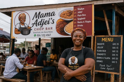
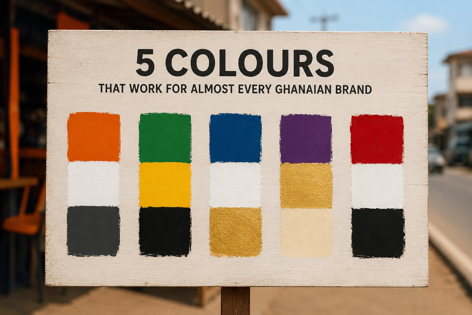
1. Orange + White + Dark Grey
Best for: Food, drinks, hospitality
Orange stimulates appetite. White keeps things clean. Dark grey adds seriousness. This combination works on roadside signs, menus, and WhatsApp stickers. Mama Adjei's chop bar uses this. So does every successful fast-food brand worldwide.
2. Green + Yellow + Black
Best for: Organic products, farming, natural goods
Green says fresh. Yellow says sunshine and happiness. Black makes text readable. This palette prints well on low-quality paper and still looks good on phone screens. Perfect for vegetable sellers, shea butter brands, or anything "natural."
3. Blue + White + Gold
Best for: Professional services, tech, finance
Blue builds trust. White creates space. Gold adds a touch of quality without being flashy. This is our most-requested palette for consulting firms, IT support, and small banks. It works everywhere.
4. Purple + Gold + Cream
Best for: Beauty, fashion, premium products
Purple feels royal. Gold feels valuable. Cream feels soft. Together, they say "quality without shouting." Glam Studio Salon uses this. It looks expensive but prints cheaply.
5. Red + White + Black
Best for: Retail, sales, urgent messaging
Red gets attention. White provides breathing room. Black anchors everything. This is the classic "sale sign" palette because it works. Use it for promotions, banners, or any time you need people to look now.
How to choose the right one
Ask yourself three questions:
- What feeling do customers need to have when they see my brand?
- Will these colours still look good on a cheap banner?
- Can someone read text easily against the background?
If you can answer those, you've already won.
You don't need a complicated colour system. You need colours that work everywhere — on a phone screen, on a roadside sign, and on a takeaway bag. That's what we've given you here.
Pick one palette. Stay consistent. Watch people start recognising your brand.